Today I have been given a tutorial on how to use curves in Adobe Illustrator, here is my end result. A bitten pear with an arrow shot through its centre
Below are some samples of text or fonts I want to use for my chosen Film/Game. I have chosen to do the Japanese movie Perfect Blue which is a crime thriller based around the life of a singer turned model.
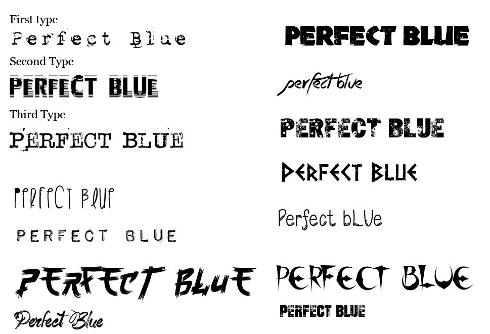
Here are a list of all the fonts I have downloaded as a possible use for my finished poster I have chosen three different fonts I would like to experiment with.
Below are some samples of text or fonts I want to use for my chosen Film/Game. I have chosen to do the Japanese movie Perfect Blue which is a crime thriller based around the life of a singer turned model.
Here are a list of all the fonts I have downloaded as a possible use for my finished poster I have chosen three different fonts I would like to experiment with.
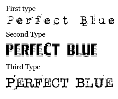
Here are my three chosen fonts I would like to work with. The first type is a simple typewriter font which I think will suit the feel of the film as I said earlier it is a crime thriller. The second font is called "Nervous" and I think this works for the style of film because of the slight blur within the font which implies imperfection and I also like how the word is still readable despite having some graphical imperfections. the third and final font is also a typewriter font but has a little less detail than the first one. I really like this font because of it's slightly distorted and ink effect.

This is my first type test for Perfect Blue. I have used various different tools in Adobe Illustrator to created different styles, art and colours. My favourite font so far is the text in the bottom of the middle row as it shows slight colours and simple texts.
No comments:
Post a Comment